
3.1 Changes in Equilibrium Price and Quantity: The Four-Step Process
Learning Objectives
By the end of this section, you will be able to:
- Identify equilibrium price and quantity through the four-step process
- Graph equilibrium price and quantity
- Contrast shifts of demand or supply and movements along a demand or supply curve
- Graph demand and supply curves, including equilibrium price and quantity, based on real-world examples
Let’s begin this discussion with a single economic event. It might be an event that affects demand, like a change in income, population, tastes, prices of substitutes or complements, or expectations about future prices. It might be an event that affects supply, like a change in natural conditions, input prices, or technology, or government policies that affect production. How does this economic event affect equilibrium price and quantity? We will analyze this question using a four-step process.
Step 1. Draw a demand and supply model before the economic change took place. Establishing the model first requires four standard pieces of information: the law of demand, which tells us the slope of the demand curve; the law of supply, which gives us the slope of the supply curve; the shift variables for demand; and the shift variables for supply. From this model, find the initial equilibrium values for price and quantity.
Step 2. Decide whether the economic change you are analyzing affects demand or supply. In other words, does the event refer to something in the list of demand factors or supply factors?
Step 3. Decide whether the effect on demand or supply causes the curve to shift to the right or to the left, and sketch the new demand or supply curve on the diagram. In other words, does the event increase or decrease the amount consumers want to buy or the amount producers want to sell?
Step 4. Identify the new equilibrium and then compare the original equilibrium price and quantity to the new equilibrium price and quantity.
Let’s consider one example that involves a shift in supply and one that involves a shift in demand. Then we will consider an example where both supply and demand shift.
Good Weather for Salmon Fishing
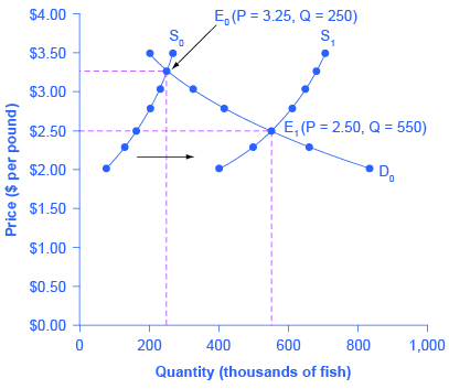
Supposed that during the summer of 2015, weather conditions were excellent for commercial salmon fishing off the Californian coast. Heavy rains meant higher than normal levels of water in the rivers, which helped the salmon to breed. Slightly cooler ocean temperatures stimulated the growth of plankton, the microscopic organisms at the bottom of the oceanic food chain, providing ocean-life with a hearty food supply. The ocean stayed calm during fishing season, so commercial fishing operations did not lose many days to bad weather. How did these climate conditions affect the quantity and price of salmon? Figure 3.2 illustrates the four-step approach (explained below) used to work through this problem. Table 3.1 also provides the information to work the problem.
|
Price per Pound |
Quantity Supplied in 2014 |
Quantity Supplied in 2015 |
Quantity Demanded |
|
$2.00 |
80 |
400 |
840 |
|
$2.25 |
120 |
480 |
680 |
|
$2.50 |
160 |
550 |
550 |
|
$2.75 |
200 |
600 |
450 |
|
$3.00 |
230 |
640 |
350 |
|
$3.25 |
250 |
670 |
250 |
|
$3.50 |
270 |
700 |
200 |
Step 1. Draw a demand and supply model to illustrate the market for salmon in the year before the good weather conditions began. The demand curve (D0) and the supply curve (S0) show that the original equilibrium price is $3.25 per pound and the original equilibrium quantity is 250,000 fish. (This price per pound is what commercial buyers pay at the fishing docks. What consumers pay at the store is higher.)
Step 2. Did the economic event affect supply or demand? Good weather is an example of a natural condition that affects supply.
Step 3. Was the effect on supply an increase or a decrease? Good weather is a change in natural conditions that increases the quantity supplied at any given price. The supply curve shifts to the right, moving from the original supply curve (S0) to the new supply curve (S1), which Figure 3.2 and Table 3.1 show.
Step 4. Compare the new equilibrium price and quantity to the original equilibrium. At the new equilibrium E1, the equilibrium price falls from $3.25 to $2.50, but the equilibrium quantity increases from 250,000 to 550,000 salmon. Notice that the equilibrium quantity demand increased, even though the demand curve did not move.
In short, good weather conditions increased the supply of California commercial salmon. The result was a higher equilibrium quantity of salmon bought and sold in the market at a lower price.
Newspapers and the Internet
According to the Pew Research Center for People and the Press, increasingly more people, especially younger people, are obtaining their news from online and digital sources. The majority of U.S. adults now own smartphones or tablets, with most of those saying that they use them in part to access the news. From 2004 to 2012, the share of Americans who reported obtaining their news from digital sources increased from 24% to 39%. How has this affected consumption of print news media, and radio and television news? Figure 3.3 and the text below illustrates using the four-step analysis to answer this question.
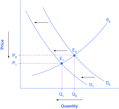
Step 1. Develop a demand and supply model to think about what the market looked like before the event. The demand curve (D0) and the supply curve (S0) show the original relationships. In this case, we perform the analysis without specific numbers on the price and quantity axis.
Step 2. Did the described change affect supply or demand? A change in tastes, from traditional news sources (print, radio, and television) to digital sources, caused a change in demand for the former.
Step 3. Was the effect on demand positive or negative? A shift to digital news sources will tend to mean a lower quantity demand for traditional news sources at every given price, causing the demand curve for print and other traditional news sources to shift to the left, from D0 to D1.
Step 4. Compare the new equilibrium price and quantity to the original equilibrium price. The new equilibrium (E1) occurs at a lower quantity and a lower price than the original equilibrium (E0).
The decline in print news reading predates 2004. Print newspaper circulation peaked in 1973 and has declined since then due to competition from television and radio news. In 1991, 55% of Americans indicated they received their news from print sources, while only 29% did so in 2012.
Radio news has followed a similar path in recent decades, with the share of Americans obtaining their news from radio declining from 54% in 1991 to 33% in 2012. Television news has held its own over the last 15 years, with a market share staying in the mid to upper fifties. What does this suggest for the future, given that two-thirds of Americans under 30 years old say they do not obtain their news from television at all?
The Interconnections and Speed of Adjustment in Real Markets
In the real world, many factors that affect demand and supply can change all at once. For example, the demand for cars might increase because of rising incomes and population, and it might decrease because of rising gasoline prices (a complementary good). Likewise, the supply of cars might increase because of innovative new technologies that reduce the cost of car production, and it might decrease as a result of new government regulations requiring the installation of costly pollution-control technology.
Moreover, rising income, population, or gasoline prices will affect many markets, not just cars. How can an economist sort out all these interconnected events? The answer lies in the ceteris paribus assumption. Look at how each economic event affects each market, one event at a time, holding all else constant. Then combine the analyses to see the net effect.
A Combined Example
The U.S. Postal Service faces difficult challenges. Compensation for postal workers tends to increase annually due to cost-of-living increases. At the same time, increasingly more people are using email, text, and social media platforms to communicate. What does this suggest about the continued viability of the Postal Service? Figure 3.4 and the text below illustrate this using four-step analysis to answer this question.
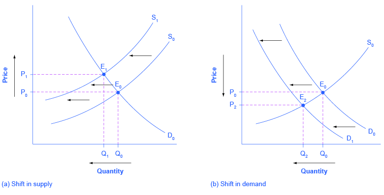
Since this problem involves two disturbances, we need two four-step analyses; the first to analyze the effects of higher compensation for postal workers, the second to analyze the effects of many people switching from “snail-mail” to email and other types of digital messaging.
Figure 3.4 (a) shows the shift in supply discussed in the following steps.
Step 1. Draw a demand and supply model to illustrate what the market for the U.S. Postal Service looked like before this scenario starts. The demand curve (D0) and the supply curve (S0) show the original relationships.
Step 2. Did the described change affect supply or demand? Labor compensation is a cost of production. A change in production costs caused a change in supply for the Postal Service.
Step 3. Was the effect on supply positive or negative? Higher labor compensation leads to a lower quantity of postal services supplied at every given price, causing the supply curve for postal services to shift to the left, from S0 to S1.
Step 4. Compare the new equilibrium price and quantity to the original equilibrium price. The new equilibrium (E1) occurs at a lower quantity and a higher price than the original equilibrium (E0).
Figure 3.4 (b) shows the shift in demand in the following steps.
Step 1. Draw a demand and supply model to illustrate what the market for U.S. Postal Services looked like before this scenario starts. The demand curve (D0) and the supply curve (S0) show the original relationships. Note that this diagram is independent from the diagram in panel (a).
Step 2. Did the described change affect supply or demand? A change in tastes away from snail-mail toward digital messages will cause a change in demand for the Postal Service.
Step 3. Was the effect on demand positive or negative? A change in tastes away from snail-mail toward digital messages causes lower quantity demanded for postal services at every given price, causing the demand curve for postal services to shift to the left, from D0 to D1.
Step 4. Compare the new equilibrium price and quantity to the original equilibrium price. The new equilibrium (E2) occurs at a lower quantity and a lower price than the original equilibrium (E0).
The final step in a scenario where both supply and demand shift is to combine the two individual analyses to determine what happens to the equilibrium quantity and price. Graphically, we superimpose the previous two diagrams one on top of the other, as in Figure 3.5.
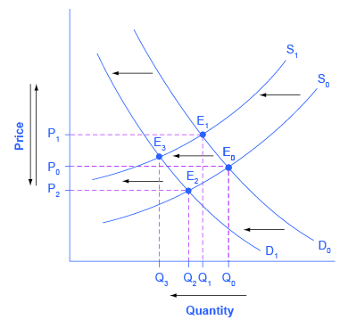
Following are the results:
Effect on Quantity: The effect of higher labor compensation on Postal Services, because it raises the cost of production, is to decrease the equilibrium quantity. The effect of a change in tastes away from snail-mail is to decrease the equilibrium quantity. Since both shifts are to the left, the overall impact is a decrease in the equilibrium quantity of Postal Services (Q3). This is easy to see graphically, since Q3 is to the left of Q0.
Effect on Price: The overall effect on price is more complicated. The effect of higher labor compensation on Postal Services, because it raises the cost of production, is to increase the equilibrium price. The effect of a change in tastes away from snail-mail is to decrease the equilibrium price. Since the two effects are in opposite directions, unless we know the magnitudes of the two effects, the overall effect is unclear. This is not unusual. When both curves shift, typically we can determine the overall effect on price or on quantity, but not on both. In this case, we determined the overall effect on the equilibrium quantity, but not on the equilibrium price. In other cases, it might be the opposite.
The next Clear It Up feature focuses on the difference between shifts of supply or demand and movements along a curve.
CLEAR IT UP
What is the difference between shifts of demand or supply versus movements along a demand or supply curve?
One common mistake in applying the demand and supply framework is to confuse the shift of a demand or a supply curve with movement along a demand or supply curve. As an example, consider a problem that asks whether a drought will increase or decrease the equilibrium quantity and equilibrium price of wheat. Lee, a student in an introductory economics class, might reason:
“Well, it is clear that a drought reduces supply, so I will shift back the supply curve, as in the shift from the original supply curve (S0) to (S1) on the diagram (Shift 1). The equilibrium moves from E0 to E1, the equilibrium quantity is lower and the equilibrium price is higher. Then, a higher price makes farmers more likely to supply the good, so the supply curve shifts right, represented by the shift from S1 to S2, as you can see on the diagram (Shift 2). As shift 2 occurs, the equilibrium moves from E1 to E2. The higher price, however, also reduces demand and causes demand to shift back, like the shift from the original demand curve, (D0) to (D1) on the diagram (Shift 3), and the equilibrium moves from (E2) to (E3).”

At about this point, Lee suspects that this answer is headed down the wrong path. Think about what might be wrong with Lee’s logic, and then read the answer that follows.
Answer: Lee’s first step is correct: that is, a drought shifts back the supply curve of wheat and leads to a prediction of a lower equilibrium quantity and a higher equilibrium price. This corresponds to a movement along the original demand curve (D0), from E0 to E1. The rest of Lee’s argument is wrong, because it mixes up shifts in supply with quantity supplied, and shifts in demand with quantity demanded. A higher or lower price never shifts the supply curve, as suggested by the shift in supply from S1 to S2. Instead, a price change leads to a movement along a given supply curve. Similarly, a higher or lower price never shifts a demand curve, as suggested in the shift from D0 to D1. Instead, a price change leads to a movement along a given demand curve. Remember, a change in the price of a good never causes the demand or supply curve for that good to shift.
Think carefully about the timeline of events: What happens first, what happens next? What is the cause, what is the effect? If you keep the order right, you are more likely to get the analysis correct.
In the four-step analysis of how economic events affect equilibrium price and quantity, the movement from the old to the new equilibrium seems immediate. As a practical matter, however, prices and quantities often do not zoom straight to equilibrium. More realistically, when an economic event causes demand or supply to shift, prices and quantities set off in the general direction of equilibrium. Even as they are moving toward one new equilibrium, a subsequent change in demand or supply often pushes prices toward another equilibrium.
SELF-CHECK QUESTIONS
- Let’s think about the market for air travel. From August 2014 to January 2015, the price of jet fuel increased by roughly 47%. Using the four-step analysis, how do you think this fuel price increase affected the equilibrium price and quantity of air travel?
- A tariff is a tax on imported goods. Suppose the U.S. government cuts the tariff on imported flat screen televisions. Using the four-step analysis, how do you think the tariff reduction will affect the equilibrium price and quantity of flat screen TVs?
